The Gauge Brand Style Guide
What's in the style guide
In the Gauge brand assets and style guide, you'll find a style guide document, logo images and the official font. It has everything you need to represent Gauge visually as it was intended to be represented.
Logo
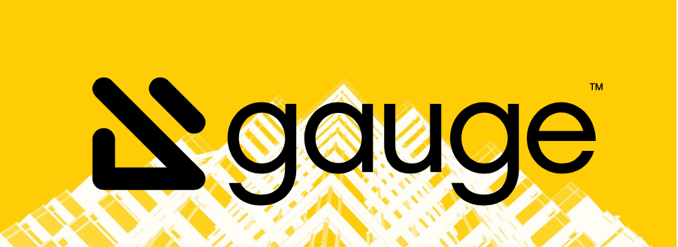
The Gauge wordmark must always appear in black or white. The word 'gauge' in this context must not be separated from the glyph.
The Gauge logo must be displayed with adequate space between itself and other elements, greater than or equal to half the height of the glyph.
Alternate marks are intended to be used in addition to the Gauge or where the word 'Gauge' appears in lieu of the logo. An example of this might be in the corner of a presentation, or as a sticker or decal.

 >
>
Color
The Gauge color palette conveys a tone of thoughtful engagement with a distinct edge.
- HEX: #FFCC00
- RGB: 255, 204, 0
- CMYK: 0, 19, 100, 0
- HEX: #25282D
- RGB: 37, 40, 45
- CMYK: 76, 67, 59, 65
Images
Photography is a key component to the Gauge brand, as it is used both within layout as well as in applications with the brandmarks themselves. All photography should be used in grayscale only, with levels that emphasize the contrast while still embracing interesting textures. Additionally, the yellow brand color can be used as an overlay for photography. Check out the style guide for the recommended photo themes.